Interpreting tables, graphs and misleading displays
What the standard asks
- The explanatory notes require you to interpret "a wide variety of statistical tables and graphs". In practice that means two skills:
- reading a display accurately, including its axes, units and denominators
- spotting a display that has been built to suggest more than the data show.
Check the axes first
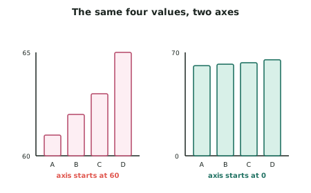
- A vertical axis that does not start at zero exaggerates differences. Bars are read by area and height, so cutting off the bottom multiplies the apparent difference many times over.
- Truncation is not automatically dishonest. For a line graph of a share price or a temperature series, starting at zero would waste the whole plot. The rule is:
- Bar charts should start at zero, because the bar's length is the message.
- Line graphs may be truncated, but the axis must be clearly labelled so the reader can see it.
- Check the scale is even. Unequal gaps between axis values — 1990, 2000, 2005, 2007, 2008 — distort the apparent rate of change.
- Check for a broken or reversed axis. A vertical axis running downwards has been used to make a rise look like a fall.
Check the denominator
- Counts versus rates. A region with more people will record more of almost everything. Comparing Auckland with Southland on counts of anything is meaningless; the comparison must be per head of population.
- Percentages of what? A 200% increase in cases is very different if the base was 2 or 2 000.
- Changing denominators over time. If a definition changed mid-series — what counts as "unemployed", or which injuries are "serious" — the series is not comparable across the break.
Common distortions
| Distortion | What it does |
|---|---|
| Truncated bar axis | Multiplies small differences visually |
| 3-D or pictogram charts | The eye reads area or volume while the data are in one dimension, so doubling a value looks like a four- or eight-fold rise |
| Cherry-picked time window | Starting the graph at an unusual peak or trough manufactures a trend |
| Dual axes | Two series on different scales, arranged so they appear to move together |
| Missing sample sizes | A category with plotted beside one with |
| Percentages that do not sum sensibly | Multiple-response questions presented as if exclusive |
Reading a table properly
- Read the row and column totals first — they tell you the denominators.
- Ask which way the percentages run. "70% of those who cycled were under 30" and "70% of those under 30 cycled" are completely different statements from the same table, and reports confuse them constantly.
- Look for the missing category. A table of responses summing to 88% has 12% unaccounted for, and where it went matters.
Distributions, not just averages
- A single average conceals the shape of the data. Ask for the spread and check for skew.
- Income and house prices are strongly right-skewed, so the mean is pulled above the median by a small number of very high values. A report quoting the mean house price is describing a different typical house from one quoting the median.
- Which average was used, and why that one? If a report quotes the mean for skewed data, it has chosen the larger number.
Worked ExampleCritiquing a display and its accompanying claim
A report on regional road safety includes this table and a bar chart of the death counts, with the vertical axis running from 20 to 60.
| Region | Road deaths (year) | Population |
|---|---|---|
| Region A | 58 | 1 700 000 |
| Region B | 41 | 340 000 |
| Region C | 24 | 100 000 |
"Region A has by far the worst road safety record in the country, with more than double the road deaths of Region C."
Evaluate the display and the claim.
Step 1 — Identify the fault in the measure
The table gives counts, and the regions have very different populations. Region A has 17 times the population of Region C.
More people means more drivers, more vehicle kilometres travelled and more roads, so a higher count of deaths is expected even if Region A were the safest region in the country.
Step 2 — Convert to rates
Step 2a — Choose the rate. Deaths per 100 000 people is the standard measure.
Step 2b — Compare.
Step 3 — Critique the graph
The bar chart's vertical axis runs from 20 to 60 rather than from 0.
Effect on the reader. Region A's bar (58) rises 38 units above the axis; Region C's bar (24) rises just 4 units. The bars appear in a ratio of about 9.5 to 1, when the underlying counts are in a ratio of about 2.4 to 1.