Box plots and the five-number summary
The five-number summary
- Ordering a data set and picking out five values summarises its shape:
- Minimum — the smallest value.
- Lower quartile () — a quarter of the way through the ordered data.
- Median — the middle value (half way).
- Upper quartile () — three quarters of the way through.
- Maximum — the largest value.
- The median is the measure of centre for an inference. The interquartile range, , is the measure of spread.
Box plots
- A box plot draws the five-number summary on a number line.
- The box runs from to , so it holds the middle 50% of the data. Its width is the IQR.
- The line inside the box marks the median. The whiskers reach out to the minimum and maximum.
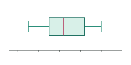
- Because the box is the middle 50%, a narrow box means the values are tightly bunched; a wide box means they are spread out.
Dot plots
- A dot plot shows every value as a dot stacked above the number line, so you see individual points and gaps that a box plot hides.
- It is ideal for small samples and for spotting clusters and outliers.
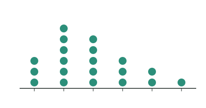
- A good analysis often shows both: dots for the raw values, a box plot beneath for the summary.
Reading centre and spread from a box plot
- Centre: read the median line — a typical value for the group.
- Spread: the IQR is the box width; the range is (the whole whisker-to-whisker length).
- Shape: if the median sits in the middle of the box and the whiskers are even, the data is roughly symmetric. If the median is pushed to one side, the data is skewed toward the longer side.
A box plot of the ages (years) of trees in a reserve has minimum 4, , median 18, and maximum 46. Find the IQR and the range, and comment on the shape.
Step 1 — Interquartile range
Step 2 — Range
Step 3 — Shape
The median (18) is closer to (12) than to (30), and the upper whisker (30→46) is longer than the lower one (4→12). So the ages are skewed toward the older trees — a few much older trees stretch the top end.
Choosing the display
- Use a dot plot to see every value in a small sample.
- Use a box plot to summarise spread and centre and to compare groups side by side on one scale.
Test yourself
Practice by grade
One question each at Achieved, Merit and Excellence. Have a go, then compare with the model answer.
A sample has minimum 6, , median 15, , maximum 28. Find the IQR and the range.
For the sample above (, median 15, ), describe the shape of the middle 50% and justify your answer.
A dot plot and a box plot are drawn for the same 12 values. Explain what the dot plot can show that the box plot hides, and when this matters for an inference.