Graphs, and how to describe a pattern
The graphs the paper uses
- Line graph — a value changing over time. Best for trends and for rate of change.
- Bar graph — comparing separate categories, or one value across months or years.
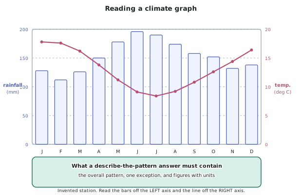
- Climate graph — a combined graph: rainfall as bars on the left axis, mean temperature as a line on the right axis, twelve months across the bottom.
- Pie graph — proportions of one whole. Useful only when the slices sum to 100 per cent.
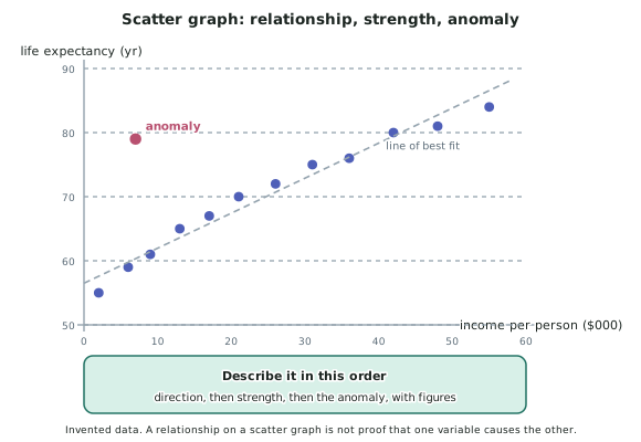
- Scatter graph — two variables plotted against each other, to show whether they are related.
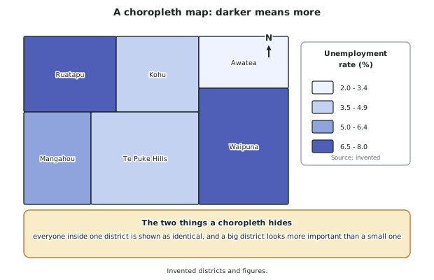
- Choropleth map — areas shaded by value, darker meaning more.
- Population pyramid — age groups stacked, males one side and females the other.
- Flow line map — movements drawn as lines whose thickness is proportional to the quantity moving.
Reading a value off a graph
- Find the units first. Thousands, per cent and millimetres look identical if you skip the axis label.
- Check whether an axis starts at zero. A truncated axis makes small differences look enormous.
- On a dual-axis graph, read each series off its own axis. On a climate graph, bars go with the left axis and the line with the right — reading the line off the rainfall axis is the standard error.
- Interpolate carefully between gridlines, and quote the value to the precision the graph supports. A graph with gridlines every 50 mm does not support an answer of 137 mm.
Describing a pattern: always in the same order
- A pattern is a definite spatial or temporal arrangement. Describing one is a marked skill, and it has a reliable order.
- State the overall pattern first, in one sentence. Rainfall is highest in winter and lowest in late summer.
- Quantify it with figures and units taken from the graph. Rainfall peaks at about 196 mm in June and falls to about 112 mm in February.
- Give the range or the size of the change. A difference of about 84 mm between the wettest and driest months.
- Name any exception or anomaly, and say how it departs from the pattern.
- Never describe a graph point by point. Listing twelve monthly values is not a description of a pattern; it is a transcription of the graph, and it earns almost nothing.
Spatial patterns need spatial words
- For a choropleth or a distribution map, describe where the high and low values are, not just that they differ.
- Use directions and named places: the highest rates are in the two northern districts, and the lowest along the eastern coast.
- Say whether the pattern is clustered, even, linear or random.
- Give the range — the highest and lowest classes — and name a district in each.
Rate of change: fastest and slowest
- The paper often asks which period showed the most rapid or the slowest change.
- On a line graph the answer is the steepest and the flattest section, not the highest and lowest points. A graph can be at its highest while barely changing.
- Support it with figures: the fastest rise was between 2019 and 2021, from about 9,000 to about 22,000, roughly 13,000 in two years.
- Watch for a fall. A negative change can be the most rapid change on the graph.
Percentages and proportions
- Read a percentage straight off a pie graph or a stacked bar rather than calculating it.
- Percentage of a total: part divided by whole, times 100.
- Beware the percentage of a small base. A rise from 2 to 4 is a 100 per cent increase and an increase of two.
- Say which base you used. Twelve per cent of the district's population, not just twelve per cent.
Scatter graphs and the trap inside them
- Describe a scatter graph in three parts: direction (positive, negative or none), strength (how closely the points follow a line), then any anomaly.
- A line of best fit is drawn through the middle of the points, with roughly as many above as below. It is not joined dot to dot.
- A relationship is not a cause. Two variables can rise together because a third thing drives both. Saying that one causes the other, when the graph alone is your evidence, is a claim the data cannot support.
- An anomaly is a point that departs clearly from the relationship, and it is usually the most interesting thing on the graph — it means something local is overriding the general pattern.
Worked Example
Worked Example
The climate graph above is for an invented station, Kohu, on a west coast. It shows:
- Monthly rainfall in millimetres, as bars, read off the left axis
- Mean monthly temperature in degrees Celsius, as a line, read off the right axis
Rainfall runs from about 112 mm in February to about 196 mm in June. Temperature runs from about 17.8 degrees in January to about 8.4 degrees in July.
Describe the pattern shown by the graph.
Answer:
Step 1 — state the overall pattern for each variable, in one sentence each.
Rainfall is high all year and highest in winter, rising through autumn to a mid-winter maximum and falling again through spring.
Temperature has a clear annual cycle, with a summer maximum and a mid-winter minimum.
Step 2 — quantify each one, with units and months.
Rainfall reaches about 196 mm in June and falls to about 112 mm in February, a range of about 84 mm. No month falls below about 110 mm, so the station has no dry season.
Temperature reaches about 17.8 degrees in January and falls to about 8.4 degrees in July, an annual range of about 9.4 degrees.
Step 3 — state the relationship between the two.
The two cycles are out of phase: rainfall peaks in the month when temperature is near its lowest. The wettest months are also the coldest.
Step 4 — name the exception.
March is the exception to the smooth rise in rainfall. Rainfall rises from February to March, dips in the sense that the rise is much smaller than the rises either side, and then climbs steeply into autumn. Temperature falls smoothly with no month departing from the curve.
Step 5 — what an Achieved answer would have said, for comparison.
It rains more in winter and it is warmer in summer. True, unquantified, and it would fit almost any temperate station. The figures, units and range are what move the same observation to Merit.
The pattern, in one line: