The production possibility frontier
What the PPF shows
- A production possibility frontier (PPF) shows the maximum combinations of two goods an economy could produce if all its resources were fully and efficiently used.
- Axes are the two goods — commonly consumer goods against capital goods, but the exam has also used forestry against dairy, and consumer goods against capital/infrastructure goods.
- The curve bows outward because resources are not equally suited to both uses: as you push production of one good further, you must give up increasing amounts of the other.
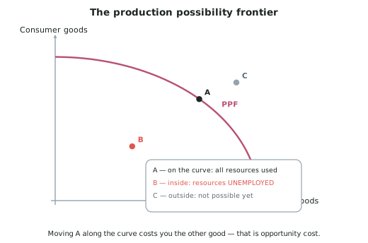
Reading points on, inside and outside the curve
| Point | Meaning |
|---|---|
| On the curve | All resources are fully employed and used efficiently — the economy is at productive capacity |
| Inside the curve | Resources are unemployed or under-used — the economy could produce more with what it already has |
| Outside the curve | Not attainable with current resources and technology |
This distinction is the most examined idea in AS91224.
Opportunity cost on the PPF
- Opportunity cost is what must be given up to get more of something.
- Moving along the curve from one point to another means producing more of one good and less of the other.
- The amount of the second good given up is the opportunity cost, and it is read off the vertical axis.
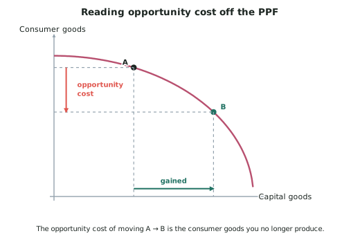
Why opportunity cost rises: the first resources moved are those best suited to the new use. As you continue, you must move resources that were much better suited to their original use, so each extra unit costs more of the other good.
Shifting the whole curve
- A shift of the PPF is a change in productive capacity — in what the economy could produce.
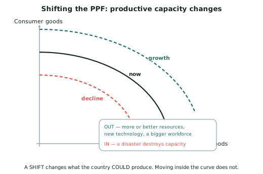
Outward shift — economic growth in the capacity sense
- More resources — a larger workforce through immigration, new investment in machinery, discovery of resources
- Better resources — new technology, better education and training, improved infrastructure
Inward shift — a fall in productive capacity
- A natural disaster destroying farmland, roads, bridges or ports
- Resource depletion — soil degradation, a collapsed fishery, deforestation
- A falling workforce, through emigration or an ageing population
- War or major destruction of capital
The choice that shapes tomorrow's frontier
- Consumer goods are consumed now and produce nothing further.
- Capital goods — machinery, infrastructure, buildings — are used to produce more in future.
- A country producing at a point with more capital goods today will have a larger PPF tomorrow.
- A country producing at a point with more consumer goods today enjoys more now and grows more slowly.
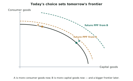
- This is the trade-off between present consumption and future growth, and it is a favourite exam question.
Worked ExampleTwo ways growth can fall
Graph Two shows an economy moving from point A on its PPF to point B inside it.
Graph Three shows an economy's PPF shifting inward, from the original curve to a smaller one.
Compare and contrast the causes and effects of these two decreases in economic growth, and explain which is worse for New Zealand's long-term growth.
Step 1 — What Graph Two shows, and what causes it
Moving from a point on the curve to a point inside it means the economy is producing less than it could with the resources it already has.
Cause: a fall in aggregate demand — a recession. Households cut spending, firms see weaker sales, so factories run below capacity and workers are laid off. Nothing has been destroyed; resources are simply not being used.
Effect: real GDP falls. Unemployment rises. Productive capacity is unchanged — the machines still exist and the workers still have their skills.
Step 2 — What Graph Three shows, and what causes it
An inward shift of the whole frontier means the economy could not produce as much as before, even at full employment.
Cause: the destruction or loss of factors of production — a natural disaster wrecking farmland, roads and ports; resource depletion; or a shrinking workforce.
Effect: real GDP falls and productive capacity falls. Every possible combination of the two goods is now smaller.
Step 3 — Compare
Both show economic growth decreasing, and both reduce real GDP and employment in the short run. On a snapshot of this year's output alone, they can look identical.
Step 4 — Contrast
The resources. In Graph Two the resources still exist; in Graph Three they are gone.
Reversibility. Graph Two is reversible with demand: a recovery in spending, lower interest rates or higher government spending will bring idle workers and machines back into use, and the economy returns to its unchanged frontier relatively quickly. Graph Three can only be reversed by rebuilding the destroyed resources — which takes years and uses up investment that would otherwise have expanded capacity.
The ceiling. In Graph Two, the economy's maximum is untouched. In Graph Three, the maximum itself has fallen, so even a full recovery of demand delivers less output than before.
Step 5 — Judge
The inward shift (Graph Three) is worse for long-term economic growth.
- Graph Two is a short-run, demand-side problem. The frontier is still there; the economy is simply not reaching it. Once demand returns, so does the output.
- Graph Three is a long-run, supply-side problem. It lowers the ceiling on everything the economy can ever produce until the resources are replaced, and replacing them consumes resources that could have built new capacity instead — so the country loses twice.