Graphing and statistics
Describing a pattern in a graph: three moves
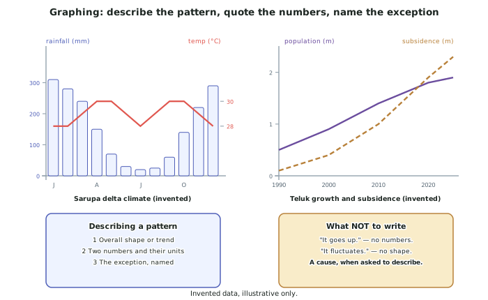
- Move 1: the overall shape. Rising, falling, stable, fluctuating, S-shaped, or rising then flattening. One clause.
- Move 2: two numbers with units. The start and the end, or the highest and the lowest, with the years attached. This is where most of the marks are.
- Move 3: the exception, named. The year that breaks the trend, the season that does not fit, the district that behaves differently.
- Never answer a "describe" question with a cause. If the question says describe the pattern and you explain why it happened, you have answered a different question and left the marks for this one on the table.
- A pattern description that would fit any graph is not a description. It fluctuates and it goes up and down say nothing about this environment.
Reading particular kinds of graph
- Climate graphs carry two variables on two axes: rainfall as bars on the left axis, temperature as a line on the right. Read the correct axis for each, and quote the wettest and driest months by name.
- Line graphs of time series: give the start value, the end value, the total change and the period. If the line changes slope, say where and by how much — that is usually the question.
- Two lines on one graph are almost always there to be compared. Say where they diverge, where they cross, and what the gap does over time.
- Bar graphs and population pyramids: compare the largest and smallest categories, and quote the difference rather than only the two values.
- Scatter graphs show a relationship: describe its direction (positive or negative), its strength (tight or scattered), and any outliers. A relationship is not a cause, and saying so is a mark of precision.
Percentages, rates and change
- Percentage change = (new − old) ÷ old × 100. Population from 0.5 to 1.9 million is (1.4 ÷ 0.5) × 100 = 280 per cent growth.
- Percentage of a total is a different thing from percentage change, and confusing them is common under pressure. Say which you mean.
- A rate is a change per unit of time: subsidence of 2.3 m over 35 years is about 66 mm a year — and the rate is usually more useful in an argument than the total.
- Always state the base. Up 280 per cent is meaningless without saying from what and over what period.
- Round sensibly, and never to more precision than the source. If a graph can be read to the nearest 0.1 m, do not report 2.34 m.
Mean, median, mode and range: choosing, not just calculating
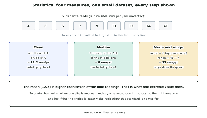
- Mean = add them, divide by how many. Sensitive to extremes.
- Median = the middle value once sorted. Sort first, every time. Unaffected by extremes.
- Mode = the most frequent value. Useful for categories, weak for continuous data.
- Range = highest minus lowest. It describes the spread, which an average never does.
- The selection is the marked part. With readings of 4, 6, 6, 7, 9, 11, 12, 14 and 41 mm/yr, the mean is 12.2 and the median is 9. The mean is higher than seven of the nine readings, because one site is extreme. Quote the median and say why you chose it.
Presenting data yourself
- If you draw a graph, it needs the same conventions as a map: a title, labelled axes with units, a sensible scale and a key if there is more than one series.
- Choose the graph type from the data. Time series → line. Parts of a whole → bar or pie. Relationship between two variables → scatter. Distribution across space → choropleth map, not a graph at all.
- A choropleth needs classes that do not overlap and a shading sequence that runs light to dark in one direction.
- Do not start a vertical axis at a value other than zero unless you say so on the graph — a truncated axis exaggerates a change and a marker will read it as imprecision.
- State what your graph shows in one sentence underneath it. That sentence is the pattern description, and it earns marks the drawing does not.
Worked Example
Worked example
Nine monitoring sites in the invented Sarupa delta recorded these subsidence rates, in millimetres per year: 41, 6, 12, 4, 9, 14, 6, 7, 11.
(i) Calculate an appropriate average and justify your choice. (ii) Describe what the data show about subsidence across the delta.
Answer:
Step 1 — sort the data first, before doing anything else.
4, 6, 6, 7, 9, 11, 12, 14, 41
Step 2 — calculate both averages so the choice can be justified.
Mean: the nine values total 110, and 110 ÷ 9 = 12.2 mm/yr.
Median: with nine values the middle one is the fifth, which is 9 mm/yr.
Step 3 — choose, and say why.
The median, 9 mm/yr, is the appropriate average here. One site records 41 mm/yr, nearly three times the next highest, and it pulls the mean up to 12.2 — a figure higher than seven of the nine readings. An average that describes almost none of the sites is not describing the delta.
Step 4 — quote the range as well, because an average alone hides the spread.
Range = 41 − 4 = 37 mm/yr. The spread is more than four times the median, which is itself a finding: subsidence is not a uniform delta-wide condition.
Step 5 — describe what the data show.
Eight of the nine sites lie between 4 and 14 mm/yr, a fairly narrow band, and one site is an extreme outlier at 41 mm/yr. That distribution — a tight group and one extreme — suggests two different situations rather than one gradient: a background rate affecting the whole delta, and one location where something additional is happening.
Step 6 — say what would settle it.
If the outlier site is in the northern districts of Teluk, where the subsidence map shows 2.3 m of total settlement, the two-cause reading is confirmed. The statistics identify that a question exists; the map answers it.