Presenting your data using the correct conventions
The three data types, and the word that changes at Merit
- The standard names three kinds of presentation: spatial, statistical and visual.
- Spatial — anything that shows where: maps, transects, annotated plans, located sketches.
- Statistical — anything that shows how much: graphs, tables, calculated means and ranges.
- Visual — anything that shows what it looks like: captioned photographs, précis sketches, annotated diagrams.
- Achieved asks for spatial, statistical and/or visual data. Merit asks for spatial, statistical and visual. The conjunction changes, and it is a countable requirement.
- So count your figures before you submit. Two of the three caps the report at Achieved no matter how well it is written — and the type most often missing is spatial, because a report full of graphs feels complete.
- A graph of distance downstream is statistical, not spatial. It is a strong figure, but you still need a map that shows where the sites are.
- Presentation must follow appropriate conventions. A figure with no title, no key and no units is not presented, it is included.
Spatial data: the map conventions
- Every map needs the same six things, and the initials BOLTSS hold them: Border, Orientation (north arrow), Legend (key), Title, Scale, Source.
- Your location map shows the study area and where the sites are, with each site labelled by the number you use everywhere else.
- Your data map puts the values themselves onto the map: proportional circles for a quantity, shading for a rate, coloured dots for a category.
- Use a rate, not a raw count, when the areas differ in size. Shading a large suburb dark because it has more of everything shows the suburb's size, not your variable.
- Keep site numbers consistent across every figure. Site 4 on the map must be site 4 on the graph, the sketch and the photograph caption. Renumbering between figures is the fastest way to lose a marker.
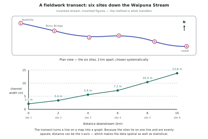
- A transect is a map and a graph at once, and it is the most efficient figure in a fieldwork report.
Statistical data: the graph conventions
- Every graph needs a title, labelled axes with units, a key if more than one series is plotted, and a source.
- Put the variable you are explaining with on the x-axis. In a downstream study that is distance, so every graph reads left to right in the same direction as the stream.
- Start a bar chart's value axis at zero. A truncated axis exaggerates differences and a marker will notice.
- Match the graph to the data:
- Line graph — a continuous variable against distance or time.
- Bar chart — comparing separate categories or places.
- Scatter graph — testing whether two measured variables are related.
- Pie chart — proportions of one whole, and only when there are few categories.
- Table — the raw values, so a reader can check your graph.
- Include the summary statistics you calculated — mean, range, and where useful the median — and say which sites produced the extremes.
- Show the raw data somewhere, usually as a table in an appendix. A graph with no table behind it cannot be checked.
Visual data, and how figures earn their place
- A photograph becomes visual data when it is captioned with location, date, time, direction faced, and a sentence saying what it shows and why it is in the report.
- Annotate directly onto the image. Arrows and short labels pointing at the gravel bar, the terrace edge, the vacant shop. An unannotated image asks the marker to guess what you noticed.
- Number every figure and refer to it in your text — Figure 3 shows the width trend flattening between sites 3 and 4 — because a figure nobody points at is decoration.
- Every figure must do a job the words cannot. Three graphs of the same data is one graph and two pieces of filler.
- Present at a consistent scale and format so the six sites can be compared at a glance.
- Check the invented Waipuna set against the requirement: a location map with BOLTSS (spatial), a transect combining plan and profile (spatial and statistical), line graphs of the four variables against distance and a raw data table (statistical), and six captioned photographs with annotated précis sketches (visual). All three types, so the Merit requirement is met.
Worked Example
Worked example
A student's invented Waipuna Stream report contains these figures:
- Figure 1: a bar chart of channel width at each site, untitled, y-axis starting at 5 m
- Figure 2: a pie chart showing the same six widths as proportions of their total
- Figure 3: four photographs, uncaptioned
- Figure 4: a table of all raw measurements
Audit this figure set against the standard, and fix it.
Answer:
Step 1 — classify what is there by type. Figures 1, 2 and 4 are statistical. Figure 3 is visual, but only once it is captioned. There is no spatial figure at all. As it stands this is a two-type report, so it is capped at Achieved.
Step 2 — fix Figure 1's conventions. It needs a title, labelled axes with units, and its value axis must start at zero — beginning at 5 m makes site 6 look about six times site 1 when it is under seven times, and exaggerating a real trend is worse than not graphing it. Better still, replace the bar chart with a line graph against distance in kilometres, because distance is continuous and it is the variable the explanation uses.
Step 3 — delete Figure 2. Width at six sites is not a proportion of a whole, so a pie chart of it is meaningless as well as repetitive. The space it frees is exactly what the missing figure needs.
Step 4 — repair Figure 3. Each photograph gains a caption with location, date, time and direction faced, plus a sentence on what it shows, and annotation arrows onto the gravel bar and terrace edge. Now it is visual data.
Step 5 — add the missing spatial figure. A location map with BOLTSS showing the catchment and the six numbered sites, and, if space allows, a transect with the plan view above and width plotted against distance below. That single figure supplies both the spatial type and the clearest statement of the pattern.
Step 6 — keep Figure 4 and renumber. The raw table stays, because it is what lets a reader check every other figure. Final set: 1 location map, 2 transect, 3 line graphs of the four variables, 4 captioned annotated photographs, 5 raw data table.