The time series plot and its four components
What makes data a time series
- A time series is a set of measurements of one variable, recorded at regular intervals over time — every month, every quarter, every year.
- The order matters. Unlike most data sets, you cannot shuffle a time series without destroying the information in it.
- The intervals must be regular, and the variable must be measured the same way throughout.
The plot comes first, always
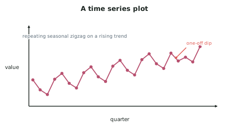
- Your first step is a time series plot: time on the horizontal axis, the variable on the vertical axis, with the points joined in time order.
- Joining the points is not decoration — it is what makes the trend and the seasonal pattern visible.
- Read the plot before you fit anything. Everything you say later comes from what you notice here.
The four components
- The additive model — the one this standard names — says every value is the sum of four parts:
- In practice you work with three, since cyclical effects are rarely separable in a school data set.
| Component | What it is | How to spot it |
|---|---|---|
| Trend | The long-term direction — rising, falling or flat | The overall slope once the zigzag is ignored |
| Seasonal | A pattern that repeats over a fixed period — every 4 quarters, every 12 months | The regular zigzag |
| Cyclical | Longer swings of no fixed length, often economic | Multi-year waves; usually not separated at this level |
| Irregular | What is left — random variation and one-off events | Scatter around the fitted pattern |
- Seasonal and cyclical are different, and the distinction is examinable. Seasonal has a fixed, known period; cyclical does not.
Describing the trend
- Say direction, strength and whether it changes:
- "The series shows a steady upward trend across the six years, rising from about 42 000 to about 61 000."
- "The trend is upward until 2021, flat from 2021 to 2023, then upward again."
- Always quote values from the data. A trend statement without numbers is Achieved-level at best; with a start value, an end value and the change, it becomes evidence-based.
Describing the seasonal pattern
- Identify which period is high and which is low, and by roughly how much:
- "Quarter 1 is consistently the highest and Quarter 3 the lowest, with a gap of about 15 000 between them."
- Then explain it from the context. This is the sentence that earns Merit:
- "Quarter 1 is highest because it covers the New Zealand summer and the school holidays, when both domestic and overseas travel peak."
Identifying unusual features
- Look for and name any of these, then explain them:
- Outliers — a single point far from the pattern
- Level shifts — the series jumps to a new level and stays there
- Changes in the seasonal pattern — the zigzag gets bigger or smaller over time
- Changes in variability — the series becomes more or less erratic
- Real New Zealand series contain real events. A tourism series covering 2020–21 shows a collapse from border closures; an electricity series shows a spike in a cold winter. Naming the event is exactly the contextual integration Excellence asks for.
Additive or multiplicative?
- The additive model assumes the seasonal swing is roughly the same size each year — the zigzag has constant amplitude.
- If the seasonal swing grows as the series grows — the zigzag fans out — the pattern is multiplicative rather than additive.
- Check this from the plot and say what you found. Noticing that the additive model is or is not appropriate, and saying why, is a genuine Excellence observation about the adequacy of the model.
Worked ExampleReading a time series plot properly
A student is given quarterly data on the number of international visitor arrivals to a New Zealand region, from 2016 to 2024. The plot shows:
- a steady rise from about 78 000 per quarter in 2016 to about 96 000 in 2019
- a collapse to under 5 000 through 2020 and 2021
- a recovery from 2022 reaching about 88 000 by 2024
- within every normal year, Quarter 1 highest and Quarter 2 lowest
- the size of the within-year swing is about 30 000 in 2016 and about 34 000 in 2024
Write the "identifying features" section of her report.
Step 1 — Describe the trend, with values
Note what this does: it gives numbers, it identifies that the trend is not uniform, and it makes the comparison with the pre-disruption peak.