Scatter plots and describing the relationship
Bivariate data
- Bivariate data is data on two numerical variables measured on the same units, collected to see whether they are related.
- The explanatory variable () is the one you think does the explaining; the response variable () is the one that responds. Put on the horizontal axis and on the vertical.
- Plot each pair as a point on a scatter plot — one point per unit.
Describing the relationship
- Describe four features, always in context:
- Trend (direction): as increases, does tend to increase (positive), decrease (negative), or show no trend?
- Strength: how closely do the points follow the trend — strong, moderate or weak? A tight cloud is strong; a widely scattered one is weak.
- Form: is the pattern linear (a straight line) or non-linear (a curve)?
- Scatter & unusual points: comment on the spread about the trend and any outliers or groupings.
Association is not causation
- A relationship on a scatter plot shows the two variables are associated — not that one causes the other.
- A lurking variable may drive both. Only a randomised experiment can establish cause, so write "associated with", not "causes".
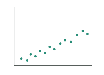
The scatter plot above shows plant height against the amount of fertiliser applied. Describe the relationship.
Trend
As the fertiliser increases, the plant height tends to increase — a positive relationship.
Strength and form
The points lie fairly close to a straight line, so the relationship is moderately strong and roughly linear.
Scatter and unusual points
There is a little scatter about the trend and no clear outliers.
In context
Overall: applying more fertiliser is associated with taller plants, in a positive, moderately strong, roughly linear way — but this does not on its own prove the fertiliser causes the extra height.
Test yourself
Practice by grade
One question each at Achieved, Merit and Excellence. Have a go, then compare with the model answer.
A scatter plot shows that as a car's age increases, its resale value tends to decrease. State the direction (trend) of this relationship.
A scatter plot of weekly study hours () against exam mark () shows points rising fairly tightly along a straight line. Describe the relationship in context.
A study finds a strong positive association between the number of ice creams sold and the number of drownings at beaches each day. Explain why concluding that buying ice creams causes drownings would be wrong.