The seven manipulations
The list is closed, and it is short
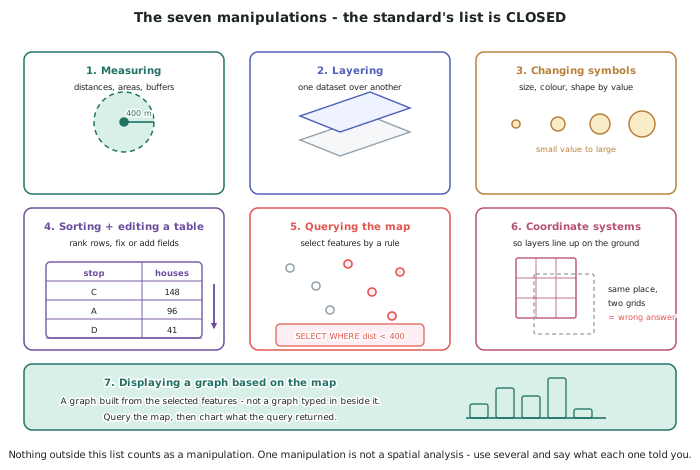
- The standard names seven manipulations, and nothing outside the list counts: measuring, layering, changing symbols, sorting and editing a table, querying the map, using coordinate systems, and displaying a graph based on the map.
- You do not have to use all seven, but one is not a spatial analysis. A solid submission uses four or five and says what each one told you.
- At Level 2 the manipulations have to be done, not evaluated. Your explanation is about the solution; the Level 3 standard is the one that asks you to explain and then evaluate the techniques themselves.
- Evidence each one. A captioned screenshot per manipulation — measuring: 400 m network catchments around all nine stops — is enough, and it takes seconds at the time.
Measuring
- Measuring covers distances, areas and catchments drawn at a set distance from a feature — often called a buffer.
- Decide straight-line or network distance before you run it, and say which. In the invented Puketawa case, a straight-line 400 m catchment counts 1,206 dwellings as served; measuring along the street network counts 1,043. The straight-line method overstates coverage by 163 dwellings.
- The difference is not random. Streets are never shorter than the direct line, so straight-line always overstates — and it overstates most where the street layout is worst, which is usually where the access problem is.
- Report the units and the method every time. 400 m network distance along road centrelines is checkable; 400 m on its own is not.
Layering
- Layering is putting one dataset over another so they can be read together, and it is where most answers actually appear.
- Order matters for readability. Areas at the bottom, lines above them, points on top. A dwelling point under a solid catchment fill is invisible, and an invisible point cannot be counted by a reader.
- Transparency is a tool, not decoration. Semi-transparent catchments let the basemap and the dwellings show through, which is what makes the gaps visible.
- Only layer what the question needs. Six layers where three would do makes the map harder to read and adds nothing to the analysis.
Changing symbols
- Changing symbols means varying size, colour or shape according to a value in the data, so the pattern appears without anyone reading a table.
- Use colour for categories and size for quantities. Served and unserved dwellings are two categories, so two colours. Stop usage is a quantity, so graduated circles.
- Two colours must be distinguishable by more than hue. Red and green look the same to a substantial minority of readers; pair colour with shape or lightness so the map still works.
- A symbol change that reveals nothing is not a manipulation. Recolouring all the dwellings blue is styling. Colouring them by whether they fall inside a catchment is analysis, because the styling carries the result.
Sorting and editing a table
- Every layer has an attribute table, one row per feature, and sorting it ranks features by any field.
- Sorting is how a ranking is produced. In Puketawa, the candidate stop sites were ranked by the number of currently unserved dwellings each would bring within 400 m — site C: 148, site A: 96, site D: 41.
- Editing includes correcting a value and adding a field. Adding a served / unserved field to the dwelling table is what lets the query result be mapped, counted and charted.
- Never edit to make the answer come out. Correct genuine errors, record what you corrected and why, and leave the rest.
Querying the map
- A query selects the features that meet a rule, and it is the manipulation that produces a countable answer.
- Write the rule in words before you build it. Select all dwellings that are not within 400 m network distance of any stop. If you cannot say it in one sentence, the query will not run either.
- Check the result against the map before believing the number. A query returning 697 unserved dwellings should look like roughly two-fifths of the town. If the number and the map disagree, the rule is wrong.
- Save the rule with the result. A number with no rule attached cannot be reproduced, and reproducibility is most of the value of doing it this way.
Using coordinate systems, and graphing from the map
- A coordinate system is what makes a layer sit in the right place on the ground. Two layers in different systems will be offset — sometimes by metres, sometimes by kilometres.
- In New Zealand, NZTM 2000 is the usual choice for national and council layers. Set every layer to the same system before you measure anything, because distances measured across mismatched layers are wrong while looking entirely reasonable.
- This is the failure mode to fear, because it produces a confident wrong answer rather than an obvious error. Check by overlaying two layers that must line up — do the road centrelines follow the roads in the aerial imagery?
- Displaying a graph based on the map means charting the result of a selection, not typing numbers into a spreadsheet beside it. Query first, then chart what the query returned — a bar of served against unserved, before and after the proposed stops.
Worked Example
Worked example
Run the Puketawa analysis using five of the seven manipulations, stating what each one contributes. The problem: how many of the 1,740 dwellings are beyond a 400 m walk of the 9 existing stops, and where should two new stops go?
Answer:
Manipulation 1 — using coordinate systems. All four layers are confirmed as NZTM 2000 before anything is measured. Overlaying the road centrelines on the 2025 aerial imagery shows them following the roads, so the layers align. What it contributes: every distance measured afterwards is trustworthy. Skipping this makes every later step wrong in a way that looks right.
Manipulation 2 — measuring. A 400 m catchment along the street network is generated around each of the 9 stops. Two methods are run deliberately, for comparison: straight-line gives catchments that cover 1,206 dwellings; network distance covers 1,043. What it contributes: the catchments, which exist in no input layer, and a first finding — the straight-line method overstates coverage by 163 dwellings, or 9.4 percentage points.
Manipulation 3 — layering. The catchments are placed over the dwelling points, with the catchments semi-transparent and the dwellings drawn on top. What it contributes: the gaps become visible. Two areas — the southern subdivision and the western streets — have dwellings with no catchment over them at all.
Manipulation 4 — querying the map. The rule, written in words first: select all dwellings not within 400 m network distance of any stop. The query returns 697 dwellings. Check: 697 of 1,740 is about 40 per cent, and the unserved areas on the map look like roughly two-fifths of the town, so the number and the map agree. What it contributes: the countable answer to the first half of the problem — 1,043 dwellings served, 59.9 per cent, and 697 unserved.
Manipulation 5 — sorting and editing a table. A served / unserved field is added to the dwelling table and populated from the query. Four candidate stop sites are then tested, and the table is sorted by dwellings gained: site C gains 148, site A gains 96, site D gains 41, site B gains 12. What it contributes: the ranking that answers the second half of the problem. Sites C and A are the two recommended.
Manipulation 6 — displaying a graph based on the map. A bar chart is built from the query results, showing served and unserved before and after the two proposed stops: 1,043 served before (59.9 per cent), 1,287 after (74.0 per cent). What it contributes: the size of the improvement, shown rather than asserted.
Checking the final arithmetic. 1,043 + 148 + 96 = 1,287. And 1,287 out of 1,740 is 74.0 per cent, up from 59.9 per cent — an improvement of 14.1 percentage points from two stops.