The layout and the solution
The layout must be a map
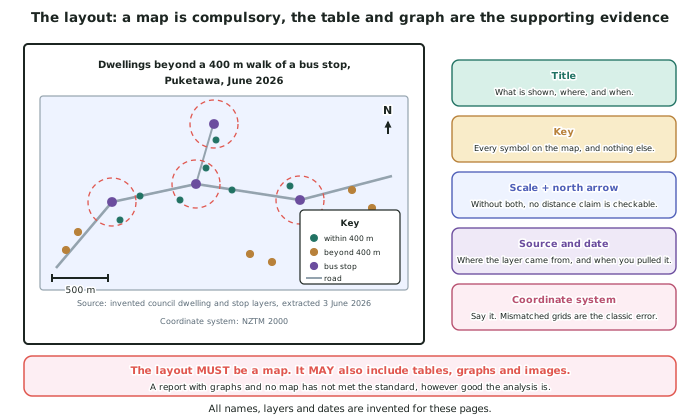
- The standard defines a layout as a map, which may also include tables, graphs and images. The map is compulsory; the rest is optional support.
- A submission with excellent graphs and no map has not met the standard, however good the analysis behind it is. This is worth checking before you hand in.
- The map must carry the answer, not merely the study area. If a reader has to read your text to find out what you concluded, the map is a location diagram.
- Merit's word is accurate. An accurate layout is one where every element is correct, complete and readable — not one that is decorated.
The six things every map must carry
- A title that says what is shown, where, and when. Dwellings beyond a 400 m walk of a bus stop, Puketawa, June 2026. Not Map 1.
- A key that explains every symbol on the map and nothing else. A key listing a layer you turned off is an error; a symbol missing from the key is a worse one.
- A scale bar. Prefer a bar to a ratio, because a bar stays correct when the map is resized or printed.
- A north arrow. Small, plain, and pointing north.
- The data source and date. Council rating units and regional council stop layer, extracted June 2026.
- The coordinate system. NZTM 2000. This is the one students omit most, and it is the one that tells a reader the distances can be trusted.
Designing a map that carries the answer
- Style by the result, not by the category. The dwellings are all dwellings; colouring them by served and unserved is what makes the map an answer rather than an inventory.
- Put the reader's eye where the finding is. The two gaps are the finding, so they should be the most visible thing on the sheet — through contrast, through an annotation, or through a circle drawn around each.
- Remove everything that does not carry information. A basemap at full opacity behind a busy map hides your own result. Turn it down or turn it off.
- Check readability at the size it will be seen. Text that is legible on your screen at 200 per cent is not legible on a printed page or a phone. Look at it at final size before you hand it in.
- Annotate directly on the map where it saves a paragraph. 697 dwellings outside all catchments written on the map is worth more than the same sentence buried in the text.
Tables and graphs: what they are for
- A table is for values a reader might want to check or compare — the ranking of candidate sites, the counts by area.
- A graph is for a comparison the map cannot show, most often a before-and-after. Coverage rising from 59.9 to 74.0 per cent is a bar chart's job, not a map's.
- Neither replaces the map, and neither should repeat it. If your graph shows the same thing as your map, drop one.
- Label both properly: a title, axis labels with units, and the source. An unlabelled axis makes a graph unusable as evidence.
Explaining the solution
- The standard asks you to explain an appropriate solution based on the manipulations, supported by evidence. All four parts of that sentence are assessed.
- State the solution as a decision, not a description. Two new stops should be placed at site C and site A, not there are gaps in coverage.
- Tie each claim to the manipulation that produced it. The query identified 697 dwellings outside all existing catchments; sorting the candidate sites by dwellings gained ranked site C first at 148.
- Give the size of the improvement. Coverage rises from 1,043 dwellings (59.9 per cent) to 1,287 (74.0 per cent), an increase of 14.1 percentage points from two stops.
- Say what the solution does not fix. 453 dwellings would still be outside a catchment, most of them in the low-density northern edge where no single stop reaches enough houses to justify itself. Naming what is left is a mark of a valid solution, not a weak one.
Validity: what Excellence adds
- Merit asks for sufficient data and an accurate layout. Excellence asks for a valid solution, fully explained, with detailed evidence.
- A solution is valid when it answers the question that was asked, with the assumptions stated so a reader can disagree with them.
- The strongest evidence of validity is a sensitivity check. Sites C and A ranked first and second at 300 m, 400 m and 500 m, and under both distance methods — the recommendation survives the parameters, even though the percentage does not.
- Separate what is robust from what is fragile, and say which is which. A percentage reported without its parameters looks more certain than it is; a ranking that survives every parameter you varied is the finding you can actually defend.
Worked Example
Worked example
Write the solution for the Puketawa problem to Excellence standard, using the manipulation results: 697 dwellings outside all catchments; site C gains 148, site A gains 96, site D gains 41, site B gains 12.
Answer:
Step 1 — state the decision first.
Two new stops should be placed at site C, on the southern subdivision's main street, and site A, on the western collector road.
Step 2 — give the evidence, tied to the manipulation that produced it.
Measuring produced 400 m network catchments around the 9 existing stops. Querying identified 697 of 1,740 dwellings — 40.1 per cent — outside every catchment. Sorting the four candidate sites by unserved dwellings gained ranked them C: 148, A: 96, D: 41, B: 12.
Step 3 — quantify the improvement, and check the arithmetic.
1,043 + 148 + 96 = 1,287 dwellings served, which is 74.0 per cent of 1,740, up from 59.9 per cent. Two stops raise coverage by 14.1 percentage points.
Step 4 — justify why these two and not the others.
Site C alone brings in more dwellings than sites A, D and B combined would if only one were built — 148 against 96, 41 and 12 individually. Sites C and A are about 1.1 km apart, so their 400 m catchments cannot overlap and their gains do not double-count. Sites D and B are rejected on numbers: D reaches 41 dwellings and B reaches 12, and a stop serving 12 dwellings adds a delay to every through passenger for almost no gain.
Step 5 — state what the solution does not fix.
453 dwellings would remain outside every catchment, most on the low-density northern edge where dwellings are spread thinly enough that no single stop reaches a useful number. Reaching them is a different problem — a route change or an on-demand service — not another stop.
Step 6 — establish validity with a sensitivity check.
The whole sequence was re-run at 300 m and 500 m, and under both straight-line and network distance. Sites C and A ranked first and second in every combination. The coverage percentage moves substantially — at 500 m straight-line it exceeds four-fifths of the town — so the percentage is an artefact of the parameters and the ranking is not.
Step 7 — state the assumptions a reader could dispute.
400 m is a convention, not a fact. Dwellings are counted, not people. Network distance assumes people walk the shortest legal route, ignoring gradient, lighting and crossings — and 34 served dwellings depend on a route I would not walk after dark, which is stated so a reader can discount them.