Describing the spatial variation
Describe and explain are two different jobs
- Describing says what the pattern looks like. Explaining says what made it. The standard marks them separately, and mixing them is why some submissions look thin in both.
- A description contains no because. The moment you write because, the description has stopped.
- Write the description first and finish it, then explain. One built in fragments between explanations is almost never complete.
- The description is where Merit is won or lost, because the Merit criterion is describing the variation in detail — not the pattern, the variation within it.
The four-part description that always works
- Part 1 — the overall statement. One sentence naming the arrangement. Retail floorspace in Tawharau is concentrated in three centres, all on or inside the ring road.
- Part 2 — the variation, quantified. Give the highest, the lowest and the distance between them. 61,000 m2 per km2 at the CBD against 3,000 at the eastern edge, 11 km away.
- Part 3 — the anomalies. Name what does not fit. Anomalies are worth more than the trend, because the trend is usually obvious and the exception is not.
- Part 4 — the pattern in the anomalies. Two anomalies that share something are a second pattern, and that sentence is what separates Merit from Achieved.
- The order matters. General first, then measured, then exceptions — an exception has no meaning without a baseline.
Mapping the pattern so the map does the describing
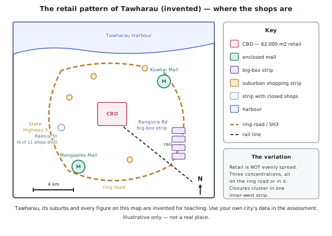
- Your map must carry the five conventions or it is not evidence: title, key, scale, north arrow, and the correct symbol type — point symbols for point features, lines for routes, shading for areas.
- Choose the map type from the data type. A choropleth shades areas and suits rates by suburb (burglaries per 1,000 households). Proportional symbols suit amounts at points (floorspace per centre). A dot map suits individual occurrences.
- Never put raw totals in a choropleth. A large suburb will always show a large total, and the map will end up mapping suburb size. Convert to a rate first.
- Annotate the map. A short note beside a symbol — 6 of 11 shops closed — turns a picture into evidence a marker can read without your text.
- One good map beats three tidy ones.
The transect — the fastest way to show variation
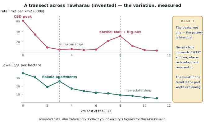
- A transect is a straight line across the city with a reading taken at fixed intervals along it. Every kilometre, every 500 m, every block — the interval matters less than keeping it constant.
- It converts a map into a graph, and a graph shows the shape of the variation in a way a map cannot: one peak or two, a smooth fall or a cliff, a steady trend or a reversal.
- Plot two variables on the same distance axis and the relationship between them becomes visible. In Tawharau retail peaks twice while dwelling density falls almost steadily, so the second retail peak cannot be explained by people living there.
- The break in the trend is the part worth writing about. Density falls from 36 to 5 dwellings per hectare, except at 3 km, where it rises to 26 because an inner suburb was redeveloped with apartments.
- Run the transect through something, not past it. A line crossing the CBD, one mall and the edge collects the variation; a line along an empty ridge collects a flat graph.
Words that make a description precise
- Use compass directions and distance together. 8 km east of the CBD locates something exactly; near the ring road could be anywhere on 24 km of road.
- Name the specific place every time. Kowhai Mall, Rakoia Street, State Highway 3. A submission full of one mall and a suburb reads as second-hand.
- Use the right density language. Clustered, linear, dispersed, concentrated, even. Each says something different, and spread out says none of them.
- Give the units. m2 per km2, dwellings per hectare, offences per 1,000 households. A number with no unit is not evidence.
Worked Example
Worked example
Here is a student's whole description of the Tawharau retail pattern, and the transect data they collected.
Their description: There are lots of shops in the middle of the city and fewer as you go out. There are also some shops in the suburbs and a mall. Overall the shops are spread out around Tawharau.
Their data, floorspace in m2 per km2, measured every kilometre east of the CBD:
0 km: 61,000 · 1: 34,000 · 2: 9,000 · 3: 5,000 · 4: 6,000 · 5: 4,000 · 6: 5,000 · 7: 22,000 · 8: 31,000 · 9: 12,000 · 10: 4,000 · 11: 3,000
Rewrite the description using the four-part structure.
Answer:
Step 1 — the overall statement. Look at the numbers, not the impression. There are two large values, 8 km apart, so fewer as you go out is contradicted by their own data at 7 and 8 km.
Retail floorspace in Tawharau is concentrated in two separate peaks along the transect rather than declining outwards from a single centre.
Step 2 — quantify the variation.
The CBD peak reaches 61,000 m2 per km2 at 0 km. Floorspace then falls steeply to 9,000 by 2 km, an 85 per cent drop in 2 km, and stays between 4,000 and 6,000 through the middle suburbs from 3 to 6 km. It then rises again to a second peak of 31,000 at 8 km, which is half the size of the CBD peak, before falling to 3,000 at the eastern edge, 11 km out.
Step 3 — name the anomalies.
The second peak is the clearest departure from a centre-outwards decline. A smaller one is at 4 km, where floorspace rises to 6,000 against 5,000 and 4,000 either side — the Kowhai Road suburban strip.
Step 4 — find the pattern in the anomalies.
Both the second peak and the 4 km rise sit on arterial roads, and the 8 km peak sits where the ring road meets the eastern arterial. Every departure from the declining trend occurs at a road junction, which is the beginning of the explanation.
Step 5 — check what was gained. The original contains no numbers. The rewrite contains nine figures, two named places, a rate of change and a second pattern — from the same data.