Drafting, conventions and commanding attention
Crafted means the drafts exist
- Crafted in the Explanatory Notes is a systematic process of reworking and reshaping. It describes the process, not the product, and because this is an internal the process is assessable.
- Your drafts are the evidence. A single polished file with no history looks like a first attempt even when it was not, so keep and number the thumbnails, the rejected crops and the version with the old headline. A rejected draft is worth more than a tidy one, because two versions differing in one thing show a decision being made.
- Four or five rough pencil layouts, matchbox size, before you open any software. Too small for detail means you can only draw hierarchy, which is all that matters at that stage. Layout decisions are cheap on paper and expensive once an hour has gone into a file.
The order to rework in
| Order | Stage | The question |
|---|---|---|
| 1 | Composition | What is dominant, where does the eye land, what can be cropped out? |
| 2 | Relationship | Is the word redundant, complementary, or in tension with the image? |
| 3 | Hierarchy | What is read first, second, third? Are the differences decisive? |
| 4 | Cut | What can be removed entirely? |
| 5 | Conventions | Spelling, punctuation, consistency — last, on the near-final version |
- Each stage constrains the next. Never proofread early: correcting a headline you are about to replace wastes the work and makes you reluctant to replace it. Never fix the composition after placing the words, because words dropped into a layout that then changes end up wherever there is room.
- Cut in this order: decoration first, then explanatory body text, then anything duplicating another element's job. Remove one element from every draft and compare.
- Write the words separately from the layout. Text written to fill a designed space will fit the space and say nothing.
Conventions — the gate at Achieved
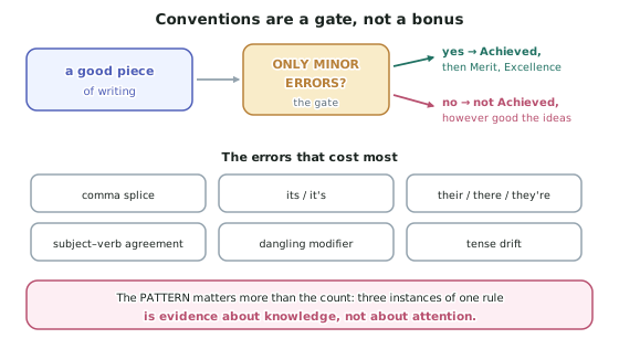
- The only minor errors requirement applies exactly as in the writing standards, and an error is far more visible at 60 point than in an essay.
- Spellcheck will not save a headline, because the commonest headline errors are correctly spelled wrong words — their for there, who's for whose, a missing possessive apostrophe.
- Consistency counts as conventions here. Two date formats, or 3.15pm in one place and 3.15 pm in another: neither is an error alone, but together they read as a text that was not planned.
- Check macrons deliberately — a missing one is a spelling error in te reo Māori, and Ōtaki is not Otaki.
Merit — reasoned, clear, sustained
- Reasoned — for every element you can say what it does, not what it is. Weak: the blue background looks calm. Reasoned: the background is desaturated so the one orange vest is the highest-contrast point. An element you cannot explain is an element to remove.
- Clear — the viewer arrives at the meaning unaided, measured by the five-second test: show it, take it away, ask what they saw and what it was saying. Run it on a stranger, not a friend. Adding words is never the clarity fix, because body text is read last and the stand-alone requirement puts clarity in the arrangement.
- Sustained — a still text has no duration, so sustained means maintained over the whole surface, and in a sequence over every frame.
- This is where Merit is actually lost, and the cause is procedural. Control fades outward from the focal point: hours on the image and headline, twenty minutes on the date, the crest and the URL. In a sequence, panel one is cropped four times and panel three is made on the last evening.
- The fix is to reverse the working order. Rework the last panel first, and the smallest elements before touching the image again, then audit the corners. The two classic symptoms — a footer two millimetres out of alignment, and an orphan crest in a size matching nothing — are trivial to fix and are never found by the person who made them.
Excellence — commanding attention
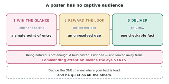
- Excellence is effectively, glossed as a text that commands attention: a claim about the viewer, not a reward for effort.
- What commands attention: a single point of entry; specificity over scale (one cup of water beats an aerial shot of a catchment); an unresolved gap, the most reliable mechanism and a free one; restraint, because among loud texts the quiet one gets looked at; one checkable fact for the viewer who gave the second look; and an absence as a sequence's final beat.
- What does not: more elements; larger, redder type; better software; a more dramatic subject; explanation in body text; and shock, because a disturbing image is looked away from.
- Attention is a response to contrast, so a text at maximum on every channel has removed its own contrast and nothing within it can stand out.
Worked Example
Worked Example
Two students submit posters on the same subject — a proposal to close a small-town swimming pool. Both are described specially for this page.
Which commands attention, and why?
Poster A wins the glance and loses everything after it. A bright pool and a shout are read at once and exhausted at once, so nothing rewards a second look. The words are redundant — our pool over a photograph of a pool — and the sunlit water, the capitals and the clip art all compete, so there is no single point of entry. Don't let them is an instruction, and an instruction invites the reflex why should I.
Poster B loses nothing and holds. One orange object in a grey-blue frame is a single point of entry: the eye lands in under a second with no competition. Goggles rather than the pool is specificity over scale — a child-sized object is a person, a pool is a facility. The quotation contradicting the image is the unresolved gap: nothing is claimed, so nothing can be refused, and the viewer is still looking while they resolve it. The empty concrete is restraint, making the small type look deliberate. And 21 km away and closed in winter is one checkable fact, delivered to the viewer who gave the second look — it answers the councillor without arguing with him.
The finding. Poster A is louder and gets less attention, because attention is a response to contrast and a text at maximum everywhere has none left to spend. Note what Poster B did not need: no better camera, no effects, no more dramatic subject. Every move it makes is a decision about placement — exactly what a standard that declines to assess components leaves to be marked.