Presenting data so a trend shows
What the criterion actually says
- Achieved requires "processing and presenting statistical data for two contemporary economic issues to show trends".
- "To show trends" is a purpose, not decoration. The graph must make a movement over time visible.
Choosing the right graph
| What you are showing | Use | Why |
|---|---|---|
| A trend over time | Line graph | The line's slope is the trend |
| Comparing discrete categories | Column graph | Separate bars invite comparison, not continuity |
| Two series with different units | Combination graph with two axes, or index both to a common base | Neither series gets flattened |
| A breakdown of one total | Stacked column | Shows composition and total together |
- For this standard, the line graph is the workhorse. Nearly all your data is a series over time.
- Do not use a pie chart for a trend. A pie chart shows a composition at one moment and cannot show change.
What every figure must have
- A title saying what it shows, for where, and over what period.
- Both axes labelled, with units.
- A clear time axis, evenly spaced.
- A key, if there is more than one series.
- The source and date, underneath.
- A figure number, so you can refer to it in the text.
Figure 1: New Zealand real GDP, annual % change, seasonally adjusted, 2016–2025. Source: Stats NZ, retrieved 12 March 2026.
Two series on one graph — the inter-relationship figure
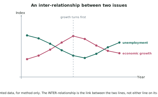
- The inter-relationship criterion is far easier to satisfy if the two issues appear on the same figure, because then the reader can see the relationship rather than being told about it.
- Two ways to do it:
Index both series to a common base year (= 1000).
- Removes the units entirely, so both can share one axis.
- Best when the two series are in different units — dollars and people, say.
Use a secondary axis.
- Left axis for one series, right axis for the other.
- Best when both are already percentages of comparable size, such as the unemployment rate and the real GDP growth rate.
The honesty rules
Start the vertical axis at zero where possible.
- Truncating the axis exaggerates small movements. If you must truncate to show detail, say so on the figure.
Keep the horizontal spacing even.
- Uneven time intervals distort the apparent slope.
Do not mix frequencies within one series.
- Quarterly data for part of the period and annual data for the rest produces a meaningless line.
Show all the data you have.
- Cutting the series at a convenient point to make a trend look stronger is the most serious presentation fault there is.
Describing a trend in words
Every figure needs a written description. A good one has four parts:
- The overall direction — rising, falling, flat, cyclical.
- The magnitude — from what to what, and by how much.
- The turning points — where it changed direction, and when.
- Anything unusual — a spike, a break, a level shift.
"Figure 1 shows real GDP growth falling from 3.8% in 2018 to −1.2% in 2020, a swing of 5 percentage points. Growth recovered sharply to 4.1% in 2021 before settling between 1% and 2% from 2023 onwards. The 2020 trough is the largest single-year fall in the series."
Worked ExampleBuilding the inter-relationship figure
You are analysing economic growth and unemployment. You have ten years of quarterly real GDP growth (annual % change) and the unemployment rate.
Show how to present these so the relationship between them is visible, and describe the trends.
⚠️ The figures below are invented, for method only.
Step 1 — Decide on one figure or two
Two separate figures would satisfy "present data for two issues to show trends" — but the reader would have to hold one graph in their head while looking at the other.
One combined figure shows both trends and makes the inter-relationship visible. Do both: one figure per issue for the individual trend sections, and one combined figure for the inter-relationship section.
Step 2 — Decide how to combine them
Both series are already percentages of comparable magnitude — real GDP growth roughly −2% to +5%, unemployment roughly 3% to 6%.
So a secondary axis is unnecessary; both fit comfortably on one percentage axis. Plot both on a single axis.
If instead you were combining real GDP in $bn with unemployment in %, you would index both to a base year = 1000 so the units disappeared.
Step 3 — Build the figure properly
Step 4 — Describe the trends, one series at a time
Economic growth. Real GDP growth held between 2.5% and 3.5% from 2016 to 2019, fell sharply to −1.2% in 2020, recovered to a peak of 4.1% in 2021, and has run between 1% and 2% since 2023. The 2020 trough is the deepest point in the series.
Unemployment. The unemployment rate fell steadily from 5.3% in 2016 to 4.0% in 2019, rose to 5.2% during 2020–21, fell back to 3.4% by 2022, and has risen gradually to 4.6% by 2025.
Step 5 — Describe the relationship between them
This is the sentence the combined figure exists for:
Step 6 — Note why the lag exists
Firms do not lay staff off the moment sales fall. They first run down stock, cut hours and overtime, and stop replacing leavers — because hiring and firing are costly, and firms hope the downturn is temporary. Only when weak demand persists do redundancies follow.
The same works in reverse: firms increase existing staff's hours before they hire, so employment recovers after output does.