Posing the question and reading the scatter plot
Posing a relationship question
- Your question must name both variables, name the population, and ask about a relationship.
- A good question:
- "What is the relationship between a car's engine size and its fuel consumption, for the vehicles in this data set?"
- Weak questions and why they fail:
- "Do bigger engines use more fuel?" — a yes/no question, not a relationship question.
- "What affects fuel consumption?" — no specific explanatory variable.
- "Is engine size related to things?" — no response variable, no population.
Choosing which variable is which
- The response variable () must be continuous — the standard requires it. Height, mass, time, price, temperature.
- The explanatory variable () may be discrete or continuous — number of bedrooms, engine size, year.
- Decide from the context, not from the data. Ask which variable could plausibly influence the other:
- Engine size → fuel consumption ✓ (fuel consumption cannot change engine size)
- House size → house price ✓
- Altitude → temperature ✓
- If both directions are plausible, say so. Hours of study and exam mark could run either way, and noting that is a contextual insight worth making.
The scatter plot
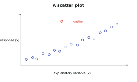
- Explanatory on , response on . Always.
- Label both axes with the variable name and units. An unlabelled scatter plot cannot earn credit as a display.
- Look at it before you fit anything. Everything you say about the relationship comes from here.
The four things to describe
- Work through these in order, every time. They are what "identifying features" means for bivariate data.
| Feature | What to say |
|---|---|
| Trend / direction | Positive (rising), negative (falling), or none |
| Nature / form | Linear (straight) or non-linear (curved) |
| Strength | How tightly the points cluster around the pattern |
| Unusual features | Outliers, groupings, changing scatter |
- Then explain each in context. That pairing — feature, then explanation — is the habit that produces Merit evidence throughout the report.
Describing strength without
- The standard says is not expected, so strength is described in words from the plot:
- Strong — points lie close to the pattern, with little scatter
- Moderate — a clear pattern but noticeable scatter
- Weak — a pattern is discernible but the scatter is large
- Support your description with what you can see: "the relationship is moderately strong — the upward pattern is clear, but at any given engine size fuel consumption varies by around 2 L/100 km."
- That sentence is better than a number, because it says what the scatter means for a prediction.
Unusual features to look for
- Outliers — points far from the general pattern. Ask whether the point is a data error, a special case, or a genuine extreme. Never delete one without saying so and giving a reason.
- Groupings or clusters — two separate clouds usually mean two different sub-populations are mixed in the data. This is a major finding, not a nuisance: it often means the analysis should be done separately for each group.
- Changing scatter (fanning) — the spread growing as increases means predictions are more reliable at one end than the other, which must be said when you make a prediction.
- Curvature — if the pattern bends, a straight line is the wrong model.
Worked ExamplePosing the question and describing the plot
A student is given a data set of 180 second-hand cars sold in New Zealand, with variables: price, odometer reading, engine size, year of manufacture, fuel type, and body type.
She decides to investigate price against odometer reading. The scatter plot shows:
- a clear downward pattern
- the fall is steep at low odometer readings and flattens off beyond about 150 000 km
- considerable scatter — at 100 000 km, prices range from about $6 000 to $21 000
- two points with prices above $60 000 while all others are under $32 000
- the scatter is wider at low odometer readings than at high ones
Write her question and the "identifying features" section.
Step 1 — Pose the relationship question
Justifying the variable roles: