Comparing the two groups
Display both groups together
- Once the data is collected, draw the treatment and control groups on the same scale — dot plots for small groups, box plots for larger ones, or both, drawn one above the other.
- The shared scale is what makes the comparison possible. Two plots on different scales cannot be compared by eye, and drawing them separately is the quickest way to lose the display marks.
- Dot plots show every value, which matters when each group has only 10 or 20 units — a box plot hides gaps and clusters that a dot plot makes obvious.
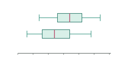
Read the two box plots as the treatment group and the control group.
The five features to compare
This standard is assessed on discussing your displays and measures, and there are five things to look at. Work through them in order every time.
- Shift — is one group's data generally higher than the other's? By how much?
- Centre — compare the medians, and quote the difference as a number in context.
- Spread — compare the interquartile ranges. A group with a larger IQR is more variable, which is itself worth explaining.
- Shape — is each group roughly symmetric, or skewed? Are they similar in shape to each other?
- Unusual features — outliers, gaps, clusters, or a group with two peaks. Point at them and suggest why they might be there.
The observed difference
- The single number that captures the effect is the observed difference between the groups — usually the difference in medians:
- Example: if the treatment median is 12 and the control median is 8, the observed difference is .
- State it with its unit and its direction, in the context of the experiment — "the treatment group's median yield was 4 kg higher".
- A positive difference suggests the treatment raised the response; a difference near 0 suggests little effect.
Overlap — how much do the groups share?
- Overlap is how much of one group's data sits inside the other group's range, and it decides how convincing the difference looks.
- Little or no overlap — the two groups are clearly separated, and the evidence for an effect is strong.
- Heavy overlap — many units in the control did as well as many in the treatment, so the difference in centres is much less convincing.
- Compare the shift with the spread. A 4 kg difference between groups whose IQRs are 2 kg each is a large effect; the same 4 kg between groups with IQRs of 15 kg is barely visible.
- Say what the overlap means in context, rather than just reporting it: "the boxes overlap between 12 and 14 kg, so some untreated plants yielded as much as some treated ones."
Writing the comparison statements
- Write in the form "I notice ... because ...", and put every statement in context with numbers from your data.
- Weak (no evidence): "the treatment group did better."
- Better (evidence): "the treatment group's median yield was 15 kg compared with 11 kg for the control — 4 kg higher."
- Best (evidence + interpretation): "the treatment group's median yield was 4 kg higher (15 kg against 11 kg), and although the boxes overlap between 12 and 14 kg, three-quarters of treated plants yielded more than the control median."
- Never describe a display without interpreting it. Listing five numbers off a box plot is description; saying what they mean for the question you asked is the analysis the standard is marking.