Evaluating the claims and the graphs
Correlation is not causation
- A report often finds that two things are linked (correlated) and then claims one causes the other. That leap is usually not justified.
- A survey or observational study can only show an association. A third confounding variable may be the real driver.
- Example: "people who drink diet soft drinks weigh more, so diet drinks cause weight gain." More likely, people who are already heavier choose diet drinks — the link runs the other way, or a confounder explains it.
- Only a randomised experiment can support a causal claim.
Over-generalising
- Watch for a result from one group being applied to everyone. A survey of Auckland university students cannot speak for all New Zealanders.
- The conclusion must not reach beyond the population the sample represents.
Misleading graphs
- A graph can be technically correct yet visually deceptive:
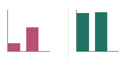
- Truncated axis — a -axis that does not start at 0 makes a tiny difference look huge (as above).
- Missing or uneven scales — hard to judge the real sizes.
- Cherry-picked range — showing only the months that suit the story.
- Misleading pictures — doubling the width and height of an icon quadruples its area for a doubled value.
Misleading statistics
- Percentages with no base — "50% more" of what? A rise from 2 to 3 cases is "50% more" but tiny.
- Averages that hide the spread — a mean can be dragged by a few extreme values.
- Relative vs absolute — "risk doubled" sounds alarming, but from 1 in a million to 2 in a million is still tiny.
Who produced it?
- Check the source: who ran and funded the study, and do they benefit from the conclusion? A result from a party with a conflict of interest deserves extra scrutiny.
A drink company's report shows a bar graph (y-axis from 95 to 100) where its "customer happiness score" rises from 96 to 98, with the headline "Happiness soars!" It concludes its new recipe caused the rise. Evaluate.
Step 1 — The graph
The -axis starts at 95, not 0, so a 2-point rise (96→98) is drawn to look like a huge jump. On a 0-based axis the bars are almost equal — the change is small.
Step 2 — The statistic
A rise of 2 points out of 100 is minor, and with no margin of error given it may be within normal variation. "Soars" is not justified.
Step 3 — The causal claim
The report is observational and run by the company (a conflict of interest). It cannot show the new recipe caused the rise — other factors (season, marketing, who was surveyed) could be responsible.
Step 4 — Overall
Test yourself
Practice by grade
One question each at Achieved, Merit and Excellence. Have a go, then compare with the model answer.
A bar graph's y-axis starts at 90 instead of 0. Explain, in one sentence, why this can mislead.
A report finds towns with more ice-cream shops have more sunburn cases, and concludes ice cream causes sunburn. Explain the flaw.
A headline reads 'New supplement cuts cold risk by 50%!' based on a company study where the cold rate fell from 4 in 1000 to 2 in 1000. Evaluate the claim.