Collecting and presenting data
What counts as primary data here
- Primary data is data you collected in the field, and at Level 3 it is required to be the main focus of the research.
- The collection methods named in the standard are observing, measuring, précis sketching, photographing, surveying, questionnaires and interviewing.
- Note what is missing. Accessing secondary sources is in the Level 2 list and not in the Level 3 one. Secondary data may support your study; it cannot be the study.
- Combine methods. A measurement plus a photograph plus a land-use record at the same site is far more usable than any one of them alone.
- Secondary data is still worth having — rainfall records for your sampling period, council monitoring data, a land-cover map — but label it clearly as secondary and use it to give context, not to make your findings.
Recording data so it survives
- Design your recording sheet before you go, with a row per site and a column per variable. Improvised notes are where data is lost.
- Record the conditions as well as the readings: date, time, weather, days since rain, who took the reading, and anything unusual.
- Photograph from a fixed point at every visit. Repeat photographs are a genuine dataset, not decoration.
- Write down what went wrong at the time. A reading taken from the bank instead of mid-channel because the flow was too high is exactly what you will need in your evaluation, and you will not remember it in three weeks.
- Enter the data into a spreadsheet the same day. Deciphering a wet field sheet a fortnight later is how errors enter.
The presentation requirement, which is countable
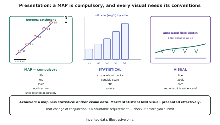
- A map is compulsory. The standard names it, and a report without one cannot meet the criterion however good the graphs are.
- At Achieved: a map plus statistical and/or visual data. At Merit: statistical AND visual, effectively presented. That change of conjunction is a countable requirement — check it before you submit.
- Statistical data means graphs and tables of your measurements.
- Visual data means photographs, annotated field sketches, cross-sections and diagrams.
- Effectively presented means the reader can see the finding without reading the caption twice.
Conventions on every visual
- The map needs: a title, a key, a scale, a north arrow, and your sites located accurately and labelled with the same names you use in the text.
- Graphs need: a title, both axes labelled with units, a sensible scale starting at zero unless you say otherwise, and a source note.
- Photographs need: a title, the date, the direction the camera faced, and a caption saying what it is evidence of — not what it shows.
- Tables need: a title, units in the column headings, and a consistent number of decimal places.
- Number every figure and refer to it in the text. Figure 3 shows… is how a reader connects your argument to your evidence, and unreferenced figures read as decoration.
Choosing the right presentation for each finding
- A spatial finding goes on a map. If your point is where, a graph is the wrong container.
- A comparison between sites goes on a bar graph; a change along the transect goes on a line graph with distance downstream on the x-axis.
- A relationship between two variables goes on a scatter graph, with the caution that a relationship is not a cause.
- A change over the four visits goes on one graph with four lines, not four separate graphs — the comparison is the point.
- Use one map that carries your main finding, with proportional symbols or shading at each site. A map with data on it is worth several plain ones.
Worked Example
Worked example
You have four visits' worth of data from five sites: nitrate (mg/L), clarity (cm), flow (m/s) and a land-use record. How should it be presented?
Answer:
Step 1 — decide what the main finding is, because the presentation should be built around it, not around the data.
The main finding in the invented study is that nitrate rises downstream and rises fastest through the pasture reach: mean values of 1.2, 3.4, 5.1, 8.9 and 8.4 mg/L at S1 to S5.
Step 2 — the compulsory map, carrying data rather than just locations.
A catchment map showing the river, the three land-use reaches shaded, and the five sites marked with proportional circles sized by mean nitrate. Title, key, scale bar, north arrow. This single figure states the finding and satisfies the compulsory requirement at the same time.
Step 3 — the statistical presentation.
A line graph with distance downstream (km) on the x-axis and nitrate (mg/L) on the y-axis, with four lines, one per visit. This shows the gradient, and it shows that the ranking of the sites is the same on every visit — which is a separate and important finding about reliability.
A table gives the full dataset with units in the headings and a consistent two decimal places, referenced from the text but not discussed line by line.
Step 4 — the visual presentation.
Two repeat photographs from the fixed point at S3, captioned as evidence: stock access and a bare bank at S3, the likely source of the clarity drop recorded between S2 and S3. An annotated field sketch of the S4 reach showing the outfall, the mixing zone and where the sample was taken 800 m below it.
Step 5 — check the countable requirement.
Map: yes. Statistical: yes. Visual: yes. Merit requires statistical AND visual, and both are present.
Step 6 — check the finding is visible without the text.
Cover the report and look at the map and the line graph. If a reader can state the finding from those two figures alone, the presentation is effective. If they cannot, the figures are illustrating the report rather than carrying it.